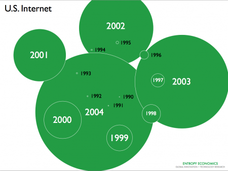
We’ve published a lot of linear and log-scale line charts of Internet traffic growth. Here’s just another way to visualize what’s been happening since 1990. The first image shows 1990-2004.
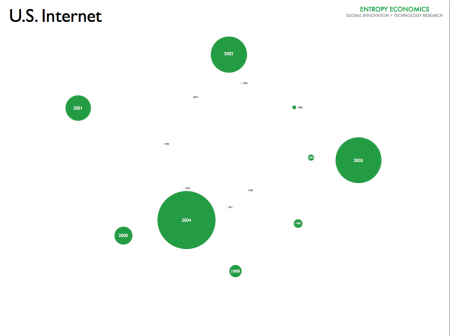
The second image scales down the first to make room for the next period.
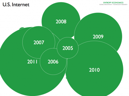
The third image, using the same scale as image 2, shows 2005-2011.
These images use data compiled by MINTS, with our own further analysis and estimations. Other estimates from Cisco and Arbor/Labovitz — and our own analysis based on those studies — show even higher traffic levels, though roughly similar growth rates.


